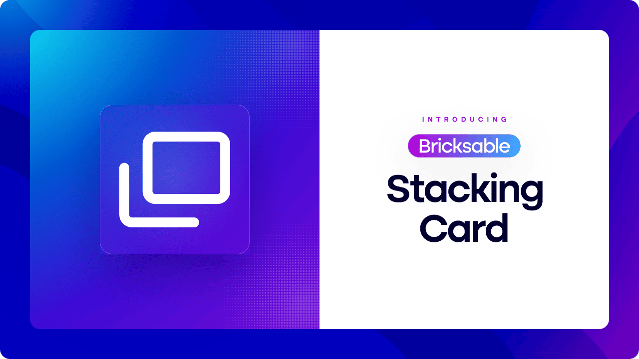
Stacking Card
Create visually engaging layouts with the Bricksable Stacking Card element. Designed to layer content with depth and motion, this flexible component lets you stack cards vertically or horizontally while maintaining full control over layout, styling, and interaction. Perfect for highlighting features, comparisons, or progressive content within Bricks Builder.
Stacking Card Features
Enhance visual hierarchy and guide user attention with an intuitive stacking experience. From flexible layout directions to subtle animations and fully customizable cards, the Stacking Card element offers the ideal blend of structure and creative freedom.
Customize Card Design
Design each card exactly the way you want using native Bricks Builder controls. Every stacking card is fully editable and can contain any Bricks element—text, images, buttons, or custom components.
Stacking Direction
Choose how your cards stack to match your layout needs. Switch effortlessly between vertical and horizontal stacking directions that adapt perfectly to your design intent.
Animate Stacking
Add subtle motion to enhance the stacking interaction. Select between no animation or a smooth fade effect that activates as cards begin to stack, creating a refined and distraction-free visual transition.
Built for Productivity
Comfort Meets Design
Designed to Support
Stack horizontally with transition.


Check Other Bricksable Elements.
Chart.

Image Accordion.

Copy To Clipboard.

Content Timeline.

Custom Cursor.

Contact Form 7.

Bricksable packs everything you need to create stunning, interactive websites with ease—no coding required. With 30+ premium elements, lightning-fast performance, and monthly updates, you’ll save hours per project and wow clients every time.
🚀 Plus, game-changing extensions launching soon—don’t miss out!